How to Build a VC Deal Flow Dashboard from Affinity Data
How VC platform and ops teams build deal flow dashboards from Affinity data in Airtable or Notion.

Every venture firm has a Monday morning ritual. Partners gather to review the pipeline, and someone on the platform or ops team has spent Friday afternoon pulling deals out of Affinity, reformatting them into a doc or deck, and hoping nothing changed over the weekend. The data is right there in the CRM. Getting it in front of the room in a usable shape is the hard part.
This guide covers how VC platform and operations teams build a live deal flow dashboard from Affinity data in Airtable or Notion: what to put on it, how to get the data out, and how to share it with partners, venture advisors, and LPs without handing out CRM seats.
Why not just use Affinity for this?
Affinity is excellent at what it does. Relationship intelligence, automatic activity capture, and warm-intro pathfinding are the reasons firms buy it, and Affinity Analytics adds native dashboards on top. But three practical problems push reporting outside the CRM:
- Analytics sits on higher tiers. Affinity Analytics is not available on every plan, so firms on standard tiers end up exporting to spreadsheets anyway.
- Most of the audience doesn't need a seat. Venture partners, operating advisors, EIRs, and LPs want to see the pipeline, not work it. Paying for CRM seats so someone can glance at a funnel once a week is hard to justify.
- Deal context lives elsewhere. IC memos, diligence notes, and portfolio updates usually live in Notion or a doc system. A dashboard next to that context beats a dashboard locked inside the CRM.
The answer is the same pattern we covered in our guide to read-only RevOps dashboards: keep Affinity as the source of truth, flow the data one way into a friendlier surface, and give everyone else view-only access.
What a deal flow dashboard should show
Resist the urge to mirror every field in Affinity. The dashboards partners actually read answer a handful of questions:
- Volume: how many new opportunities entered the pipeline this week or month, and from which sources? Source tracking is where firms find out whether deals come from warm intros, outbound, or inbound.
- Conversion: how do deals move between stages, from first meeting through diligence to term sheet? Stage-to-stage conversion rates expose where the funnel leaks.
- Velocity: how long do deals sit in each stage? A deal stuck in "partner meeting" for six weeks is a follow-up problem hiding in plain sight.
- Composition: sector, geography, and check size mix, measured against the fund's thesis.
That maps to a small slice of Affinity data: the opportunities list with stage, source, owner, sector, and key dates, plus the organizations they attach to. A dozen fields will carry the whole dashboard.
The fields worth syncing
In practice, the working set looks like this: deal name and the linked organization, current stage and the date it entered that stage, source (warm intro, outbound, inbound, event), deal owner, sector, geography, round and target check size, date added, and last activity date. Everything else, including relationship strength scores, full interaction histories, and internal debate, stays in Affinity where it belongs. If a partner asks a question the dashboard can't answer, that's a prompt to open the CRM, not to widen the sync.
Getting the data out of Affinity
CSV exports
Affinity can export list data to CSV, and for a quarterly LP report that may be enough. For a weekly partner meeting it recreates the Friday ritual: someone owns the export, the numbers age immediately, and any cleanup work has to be redone every single time.
The API and automation platforms
Affinity has a solid REST API, and platforms like n8n or Pipedream can move data from it into Airtable or Notion. This works, but somebody has to build and babysit the pipeline: handle updates (deals change stage constantly), deletions, rate limits, and schema changes. For firms without engineering support on the ops side, that maintenance burden lands on whoever set it up.
Live one-way sync
The lowest-maintenance option is a managed sync. Whalesync connects Affinity to Airtable and Notion with no code: pick the lists and fields, set the direction arrows one way from Affinity to the dashboard, and the copy stays continuously current, including stage changes and edits. Because you choose the fields, sensitive ones (valuation discussions, pass reasons, personal contact details) never leave the CRM.
Building the dashboard in Airtable
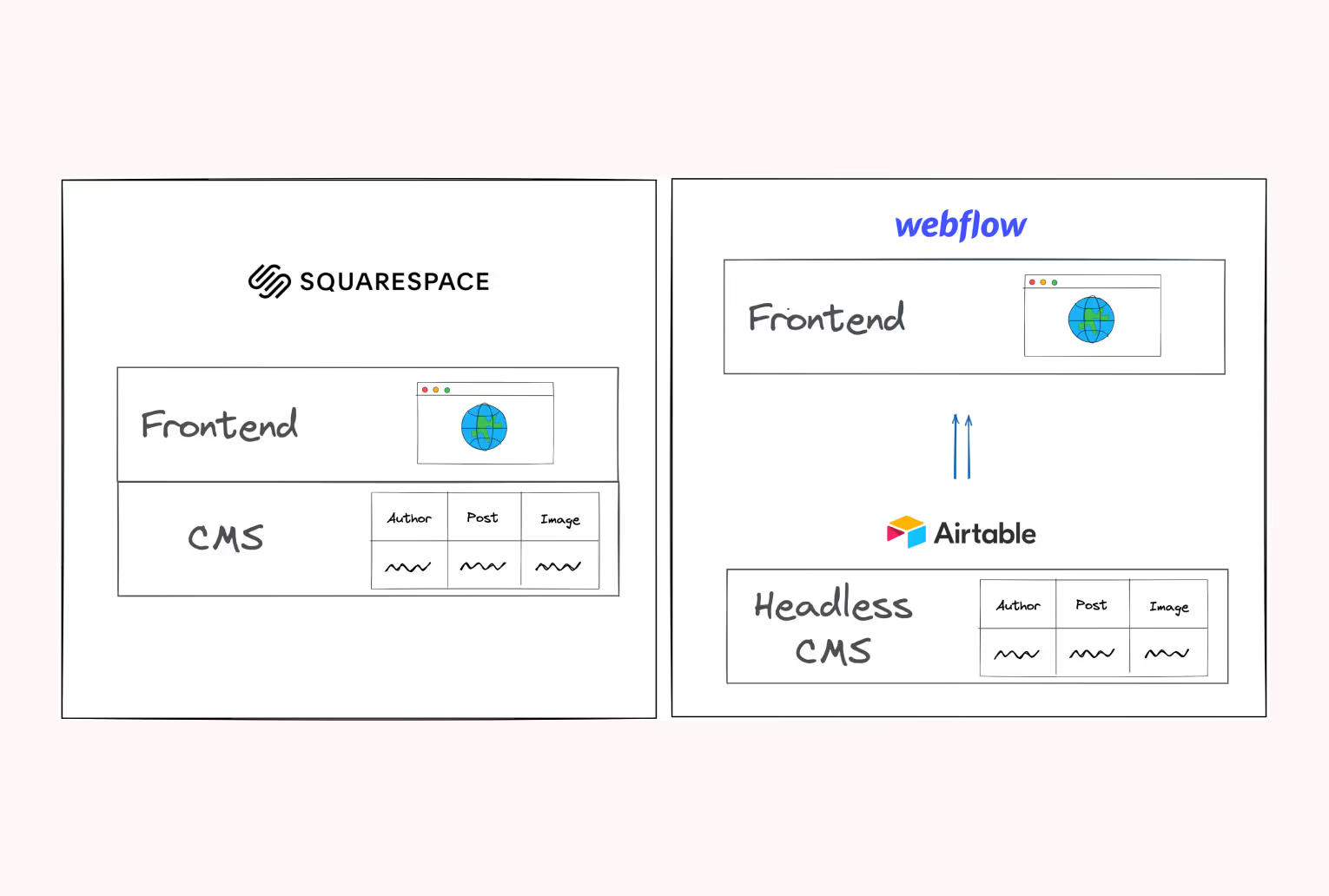
Airtable is the pick when partners want charts and a pipeline they can filter live in the meeting. Land the synced opportunities in a base, then:
- Create a kanban view grouped by stage for the classic pipeline walk, and a grid view sorted by days-in-stage to surface stuck deals.
- Use linked records and lookup fields to connect opportunities to their organizations, so sector and location roll up cleanly.
- Build an Interface on top: a funnel chart by stage, new-deals-per-week numbers, and a source breakdown. Share the interface read-only, and viewers never touch the underlying base.
If your firm already runs other workflows this way, our guide to using Airtable as a CRM covers the base-design fundamentals.
Building the dashboard in Notion
Notion wins when the pipeline should live next to the words: IC memos, diligence checklists, and portfolio pages. Sync opportunities into a Notion database, then create linked views wherever the conversation happens: a board grouped by stage on the partner-meeting page, a table of deals in diligence inside the IC workspace, a filtered view of recent passes for the quarterly retro. Set permissions to Can view for everyone who reads rather than works the pipeline. Each deal page can hold the memo, the metrics, and the live CRM fields in one place, which is something no CRM screen-share can offer.
Sharing with LPs, venture partners, and advisors
The same synced data can serve audiences beyond the partnership, with progressively narrower views. A venture partner might get the full pipeline board. An advisor helping with diligence sees a filtered view of deals in their sector. For LP updates, a filtered snapshot of quarterly activity (deals reviewed, deals progressed, investments made) drops straight into the update doc, with live numbers instead of figures somebody transcribed three days before the deadline.
Layered access is where the dashboard tools earn their keep: Airtable interfaces can be shared per-audience with domain restrictions, and Notion pages inherit clean view-only permissions. And because the sync only ever carried a dozen non-sensitive fields, even a link shared too widely exposes far less than a CRM login ever could. The most sensitive data never left Affinity in the first place.
Keep the dashboard read-only
Whichever surface you pick, the discipline is the same: data flows out of Affinity, never back in. Partners comment, ops updates the CRM. This keeps Affinity's relationship graph clean, keeps the dashboard trustworthy, and means nobody can drag a deal into the wrong stage between meetings. Add a last-synced timestamp so the room knows the numbers are live, and give the dashboard one owner on the platform team who keeps stage definitions aligned with the CRM.
From Friday ritual to live pipeline
The pieces are simple: a dozen synced fields, a kanban view, three or four charts, and read-only permissions. What changes is the meeting. Nobody re-explains a stale deck; partners scroll the live pipeline, sort by days-in-stage, and spend the time deciding instead of reconciling. If you want the plumbing to take minutes instead of a quarter, Whalesync keeps Affinity flowing one way into Airtable or Notion so the dashboard maintains itself.
Subscribe for more
Stay up to date with the latest no-code data news, strategies, and insights sent straight to your inbox!